


 Shop
Kawaii Bedroom Ideas That Still Look Grown Up
A kawaii bedroom is easy to start and surprisingly hard to finish. You buy one plush, then a printed duvet, then a shelf of blind box figures, and somewhere around the fourth purchase the room stops feeling like a grown woman’s bedroom and starts feeling like a kiosk in a mall. The problem is almost never the amount of cute. It is the absence of a system holding the cute in place.
That distinction matters if you share the room with a partner, if you work from home and see the room all day, or if you simply want a space that photographs well without apologizing for itself. This guide is about the rules that separate a collected, adult-looking kawaii room from one that reads as temporary. No theme park, no beige surrender either. Just structure.
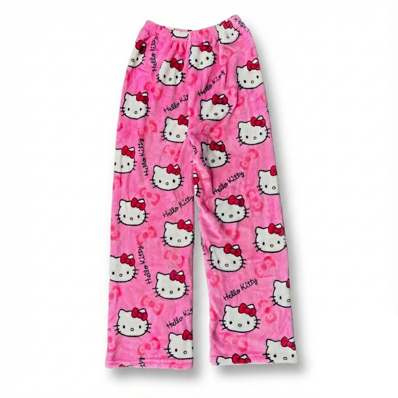
A single print reads intentional. Five prints read like laundry day.
Why Cute Rooms Start Looking Childish
The usual culprits are not the characters themselves. They are scale, saturation, and surface coverage. A wall decal of a face at forty inches wide overwhelms a 10 by 12 foot room because the motif competes with the architecture instead of working inside it. White melamine furniture with visible hardware adds a second problem, since it signals dorm furniture rather than an adult buy. Full saturation everywhere creates a third: when every object is loud, nothing reads as a choice.
Compare a room that works. One wall in a muted plaster tone. A wood nightstand with a real drawer. Two character objects on it, spaced apart, one of them small. The cute part gets more attention precisely because it is outnumbered. That is the whole trick, and it is repeatable at any budget.
The 60/30/10 Split That Fixes Pastel Rooms
Treat the room like an outfit and assign proportions. Sixty percent of the visual weight goes to a neutral base: warm white walls, oatmeal curtains, a sand or greige rug. Thirty percent goes to a supporting color family, ideally one that sits next to your accent palette: dusty lavender, muted sage, or a grayed blush. The final ten percent is your kawaii layer, and this is where all the character lives.
In practice that means the paint, walls, rug, and major upholstery stay quiet, the bedding and curtains carry the supporting tone, and the prints live in the ten percent. If you want a shelf of figures, the shelf and the wall behind it need to be in the sixty. If you want a printed duvet, the walls need to be in the sixty. You get one loud layer per room, not three.
Test before you commit. Tape fabric swatches to the wall and leave them for three days, checking them in morning light and again at night with the lamps on. Pastels that look clean in daylight frequently turn muddy under warm bulbs, and that is the light most bedrooms actually use.
Start With the Quietest Layer, Not the Cutest
Most people decorate in the wrong order. They buy the fun object first and then try to build a room around it, which usually forces everything else into supporting roles it was never designed for. Reverse it. Set bedding and window treatments first, because together they own the largest uninterrupted block of color in the room.
Two combinations work reliably. Solid duvet with a single patterned pillow, or patterned sheets under a solid duvet. Never both at full strength. Cap the decorative pillows at three, with the loudest one placed in the middle and the two quieter ones flanking it, and keep the sham sizes matched to the mattress rather than the pillow wall you see in hotel photos. A queen bed with four standard shams looks cramped in a normal-sized room.
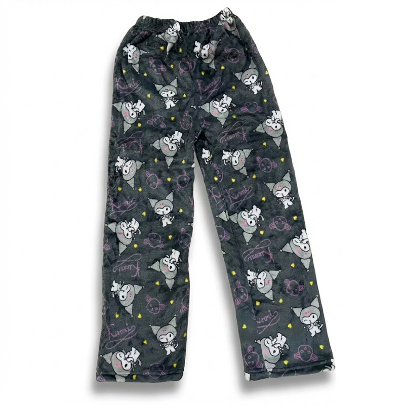
A dark gray print gives the pastel palette somewhere to land.
Lighting Does More Than Any Decor Purchase
If you change one thing, change the light. A single ceiling fixture flattens a room and makes every pastel look synthetic. Three sources at different heights will do more for the space than another shelf of collectibles, and it costs less than a new duvet.
Use 2700K bulbs, not 4000K or daylight bulbs, which make blush tones read pink-gray and lavender read institutional. Put a table lamp on each nightstand, add one lower source such as a floor lamp or a plug-in wall sconce, and put everything on a dimmer if the wiring allows. If you want the glow behind a headboard, mount a warm white strip at a forty-five degree angle facing the wall so the diode itself is never visible. Skip color changing bulbs as your primary light. They are fun for ten minutes and unflattering for the other twenty-three hours.
Display Rules for Adults
Collections are the fastest route to clutter, and clutter is what reads as immature. Three rules keep a collection looking curated instead of accumulated. First, group by color family rather than by character, so a shelf reads as a pastel gradient instead of a merchandise wall. Second, work in odd numbers and leave empty space: five to seven objects on a shelf with roughly a third of the surface bare. Third, keep a lidded storage bin and rotate the collection seasonally so the shelf stays edited without you throwing anything away.
Mount wall shelves at eye level, around sixty inches or 152 centimeters from the floor, not up near the ceiling where small objects disappear. And keep the highest shelf for the lightest, least busy items. Weight belongs low.
The same logic applies to how you dress in the room. Loungewear left on a chair is part of the visual scene, whether or not you planned for it. If you want to build a fuller wardrobe around that idea, our guide on building a kawaii wardrobe from scratch covers the pieces that hold up outside the bedroom too.
The Layer Nobody Photographs
Pajama pants and loungewear are the most used textiles in a bedroom and the least considered. They also solve a practical problem: if your bedding is quiet and your accessories are limited, a printed pair of pants becomes the ten percent accent that moves around the room instead of sitting still.
Pick fabrics that match the season of the palette. Brushed fleece reads soft and matte, which suits a calm room better than glossy synthetic satin that reflects every lamp. Wash cold, inside out, and skip the dryer sheet, since coated softeners leave a film that dulls the brushed surface over time.
There is also a mood argument for this layer that goes beyond decorating. The comfort that comes from a room you actually like has a real effect on how you wind down, and we wrote about that connection in our piece on how kawaii culture reduces stress and boosts mood. A bedroom that feels finished is easier to relax in than one that feels like a project.
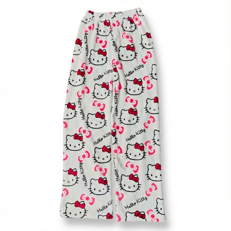
White ground, red accents: the easiest print to work into a neutral room.
Products to Check Out
Brushed fleece in a warm pink that works as the ten percent accent in a neutral room.
The quietest print of the set, closest to the sixty percent base layer of a calm palette.
Darker ground and pastel-goth accents, a natural fit for lavender or plum walls.
All ship free and come in a range of sizes.
Frequently Asked Questions
How do I make a kawaii bedroom look mature instead of childish?
Limit the loud layer to about ten percent of the room and keep the base neutral. Choose a wood or upholstered nightstand over white melamine, drop the number of character objects to a small grouped set, and add three light sources at different heights with 2700K bulbs. The cute items stay, they just stop being the room’s entire argument.
What colors pair well with kawaii bedroom decor?
Warm white, oatmeal, greige, and sand are the safest bases. For the supporting thirty percent, dusty lavender, muted sage, grayed blush, and soft butter yellow all sit comfortably next to pastel character prints. Avoid pure white walls with primary color accents, since that contrast is what pushes a room toward a nursery look.
How much does a kawaii bedroom makeover cost?
You can change the whole feel for under a hundred dollars by swapping bulbs to 2700K, adding two secondhand lamps, and buying one solid duvet cover. Paint is the next best value per square foot. New furniture is the last thing to buy, not the first, and most rooms do not need it at all.
How do I keep a character collection from looking cluttered?
Group by color family instead of by character, keep five to seven items per shelf, and leave roughly a third of the surface empty. Store the rest in a lidded bin and rotate every season. That way the shelf stays edited and the collection still grows.
Can I use printed pajama pants as part of the decor?
Yes, and it is one of the cheapest ways to add the accent layer. Choose one print per season that shares a color with your supporting palette, fold or hang it away from the bed, and let the bedding stay quiet. A white ground print is the easiest starting point for a neutral room.